
Ceci N'est Pas Un Maillot Français
 I woke up this morning and day had indeed turned into night. One of the small constants of the football world is that Adidas make the French national kit. Ever was it thus, and ever should it be. Indeed, such had the ties between the FFF (the French Football Association) and the German kit manufacturers that France have been wearing Adidas shirts since 1970. It was, I thought, set in stone. Well, it was until now. From 2011, France will wear shirts made by Nike, having signed a deal that will last for a minimum of seven years. The deal, perhaps unsurprisingly, involves the sort of figures that give me a nosebleed. It will be worth more than £240m over seven years - one of the biggest kit deals of all time - and this amount is more than four times the amount that the FFF currently receives. Following on from it's purchase of Umbro, it reinforces Nike's position as arguably the biggest players in a market that is continuing to expand in a year on year basis.
It is a decision that clearly makes business sense for the FFF, but my heart says that, somehow, the French national team won't be the French national team any more without the three stripes on the arms of the shirts with the tricolore cleverly worked into them. There is a case, however, for saying that Adidas have had this coming. In 1978, 1982 and 1984 they made three of the definitive international football shirts, but since then (the 1998 World Cup aside) they have been on a steady downward trajectory. All of this culminated (and there is a part of me that would like to think that it was this rather than the massive amounts of money being discussed that was the deciding factor) in this absolute travesty of a change shirt for Euro 2008. France reportedly wore red as a change shirt in 1906, so there's no great historical reason for this choice, and Adidas' relative silence on the subject is at odds with their usual rush to cite anything historical in the release of any new product, so it's probably pretty safe to assume that this design was based on some sort of focus group telling Adidas that "red will play well in the ABC1 demographic", or some such nonsense.
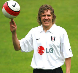
The fact of the matter is, though (and I like this no more than you like reading it), that Nike are making better kits than Adidas at the moment, and they have been for a few years. Consider, if you will, these two efforts. The US shirt is a simple, elegant design, which nods with deference to the history of the game in America, whilst that OM shirt looks, quite literally, as if it has been designed by a drunk - slurred, asymmetrical lines, disgraceful colours which break all of the rules on what combinations of colours should be seen together (and I'd go a step further and say that this particular shade or orange shouldn't even be seen on its own), and some sort of pattern woven into the fabric to give it the texture of a pair of curtains in an Indian restaurant from 1974. Adidas' most infuriating habit is their laziness. To this day, they have a tendency to design a template and re-jig the colours for all of their clients, no matter how big they are. Nike used to do this too, but one suspects that they have woken up to the fact that people are less likely to buy replica shirts if they suspect that they've been knocked up in five minutes. Nike have got to grips with referencing the history of the organisations that they're working with (Fulham, who went from consistently having the worst shirts in the Premier League to having amongst the best when they switched to Nike, have a kit that is based loosely on the design of their shirt from their 1974/75 season design, when they last reached the FA Cup Final).
A question that Adidas designers must often ask themselves is this: how difficult is it to get the three stripes design wrong? The answer to that question would appear to not be the one that they are looking for. Adidas have consistently got the shirt design wrong for a good number of clubs and countries, and they will continue to lose out on contracts of the size of the France one unless they stop designing football shirts with one eye seemingly on keeping costs down and one eye on teenagers will wear. The three stripes have been overtaken as the symbol of Adidas by the slurred line, severance with history and an almost sociopathic desire to ruin perfectly good designs with unnecessary baubles and trinkets.

4 comments:
I couldn't agree more. On Football Shirt Culture and Switch Image Project, someone has taken the trouble to represent every shirt worn in the 1978 world cup, and the majority of these are adidas, AND the majority of these are simple classic designs, with the three stripes ading to it. Superb. The rubbish they are constantly churning out now is hard to fathom - the red German away kits, the slavish use of their templates, the mess they've made of Chelsea's and Liverpool's kits...someone is getting it badly wrong. The latest adidas Euro2008 shirts are an improvement and they are simpler than their recent efforts, but they are still way behind Nike - who have recovered well from the awful strips they made in 2002 (Brazil's in particular) and 2004 (Portugal's springs to mind).
Strangely these people don't allow hotlinking??
So your link dosen't work:
http://www.football-shirts.co.uk/images/0708/fulham.jpg
I always think that Nike are interlopers into the world of football, bringing their cynical hippy business model with them
They seem to endow their products with a detestable sheen of lifestyle enhancement and empowerment. Of course the products with mythical qualities are just clothes that you exercise in.
I bloody hate their football related campaigns too, for example Joga Bonito and the recent Five-a-side one. The object of both seems to be humiliating your opponent via showing off.
As Adidas is just another sports multinational it might seem illogical to feel upset that Nike replaced them as the manufacturer of France's kit but it does feel like a sad news to me.
The Marseille kit looks like the legendary Swans Gulf Oil away kit in the mid 90s. Bright orange and blue, what a combination.
Post a Comment